Chicago Shakespeare Theater
Key Art & Marketing
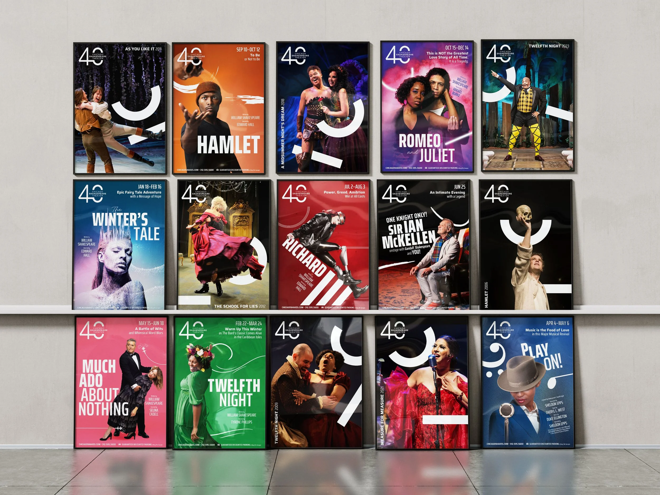
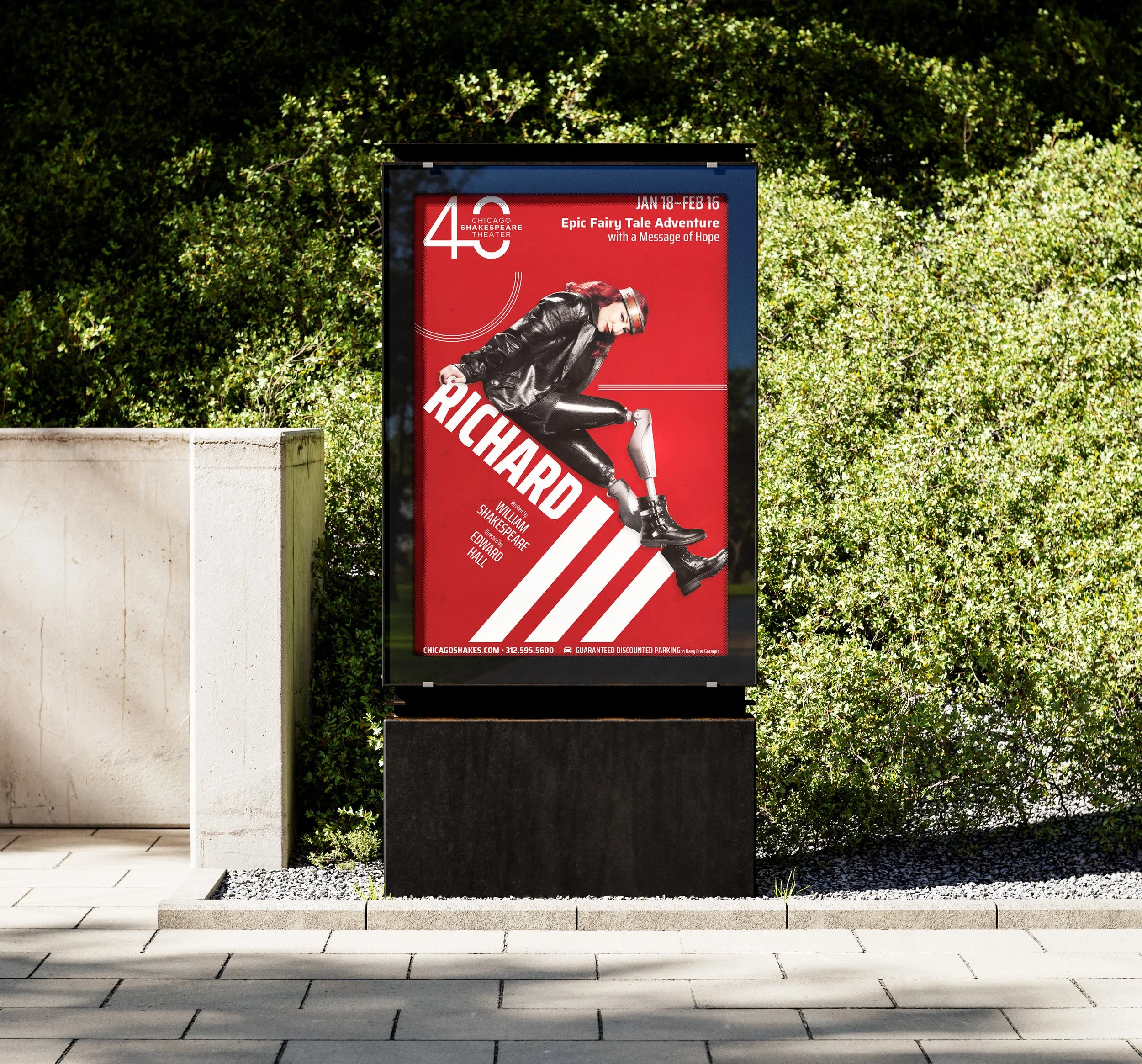
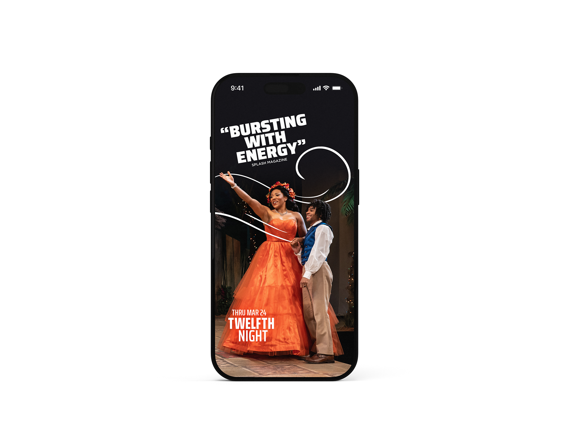
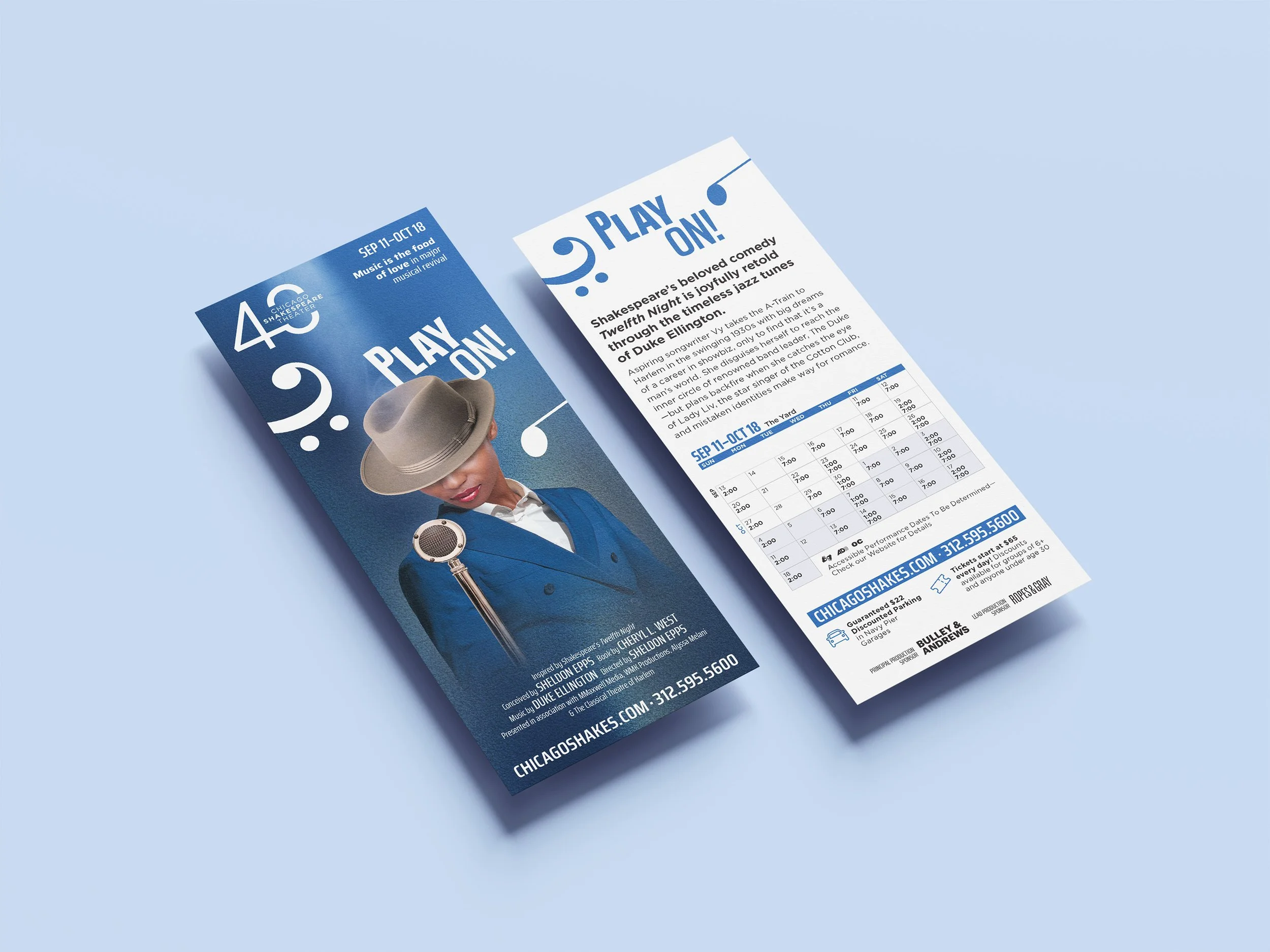
In honor of their 40th Anniversary, Chicago Shakespeare Theater needed brand elements that would both honor their history and remain flexible enough to work across a season of plays whose themes and tones varied widely. As a nod to the iambic meter famously used by Shakespeare, I incorporated symbols that mimicked the literary notation for the iamb’s light and hard stresses into the artwork for each of the season’s plays, and across institutional materials. Also key to the season’s design was a highly saturated color palette, intended to communicate a fresh approach to Shakespeare’s plays, and prevent the programming from feeling dated.
combination of concept and market work | photos by Justin Barbin, Jeff Kurysz, Liz Lauren, Jeff Sciortino